My style of portraiture is influenced by real life. While it might be more convenient or reliable to get great portraits in a studio, I find these real life portraits simply that, more living.
My style of portraiture is influenced by real life. While it might be more convenient or reliable to get great portraits in a studio, I find these real life portraits simply that, more living.
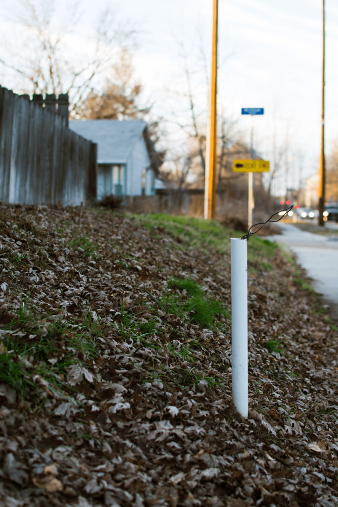
This series is a glimpse into the experience of my being a new father and student. It includes imagery of the environment where I usually do homework, where I take my daughter for walks, the route I take to get to and from school, as well as cycling shoes which I use when taking my daughter for bike rides in her stroller.
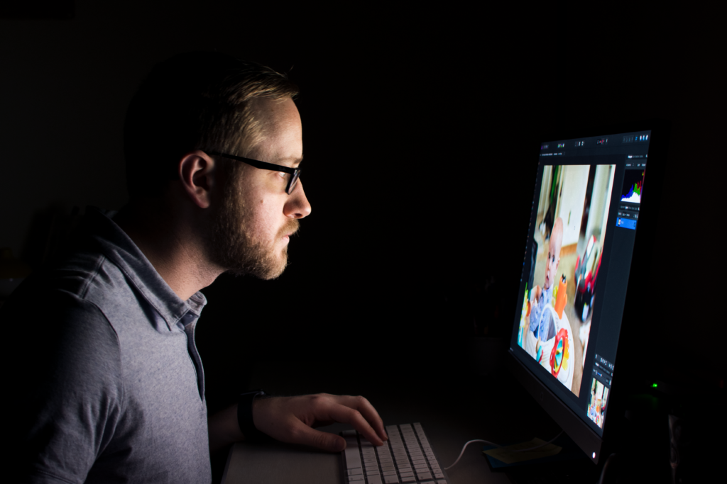
The first photograph in the series is a stylized self-portrait. The viewer can see my face and upper torso illuminated by a visible computer monitor. Seen on the monitor is a photo of my daughter being edited in Affinity Photo, a photo editing software. My hand and part of a keyboard are only slightly illuminated and the rest of the photo is mostly black.
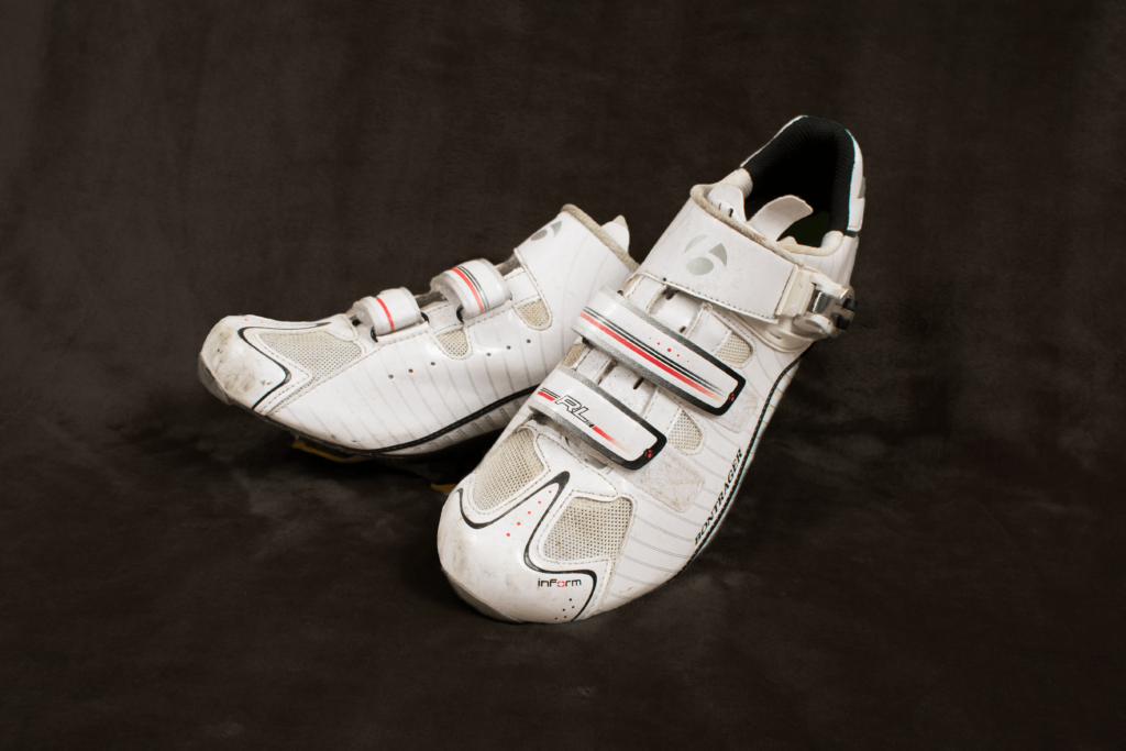
As a new father and student, my attention is stretched and my schedule is quite restricted. Depicted in the first photograph is a regular occurrence. Most days my only time to do homework is in the evening after my wife and daughter have fallen asleep. This photograph shows the priorities of my life and how I find balance. The second photograph continues the theme of school life balance, depicting a part of my route to school on my bike. My ability to ride to and from school is a blessing, as I don’t have much time outside of that ride to get exercise. Cycling is my favorite form of exercise. With a background in cycling, I have most of the equipment for competitive road cycling, and any chance I get, I try to ride for training. This aspect of my life is represented by the inclusion of a photograph of my cycling shoes. The photograph combines exercise with my love for my daughter as it is of a place where I regularly take her on walks to get out of the house and take a brake from homework.
This series includes aspects of my personal style while exploring a new one. My usual style is to find natural or living opportunities to take candid photographs. This can be frustrating when I fail to achieve a good photograph, but this is style is seen in the two photographs on the street. This is one of the first times I’ve used a directory style in a self-portrait. By using the monitor to illuminate my face, and retaking the image several times with subtle changes was quite the learning experience. The room was not quite as dark as seen in the photo, but a tripod was still needed. The photograph of my cycling shoes utilized studio lighting and strobes. After bringing the photo into photoshop, I chose to bring the background levels down to better resemble the self portrait photo and create more continuity across my series.
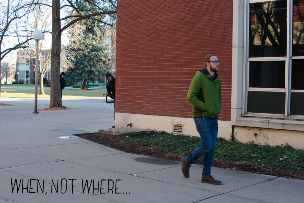
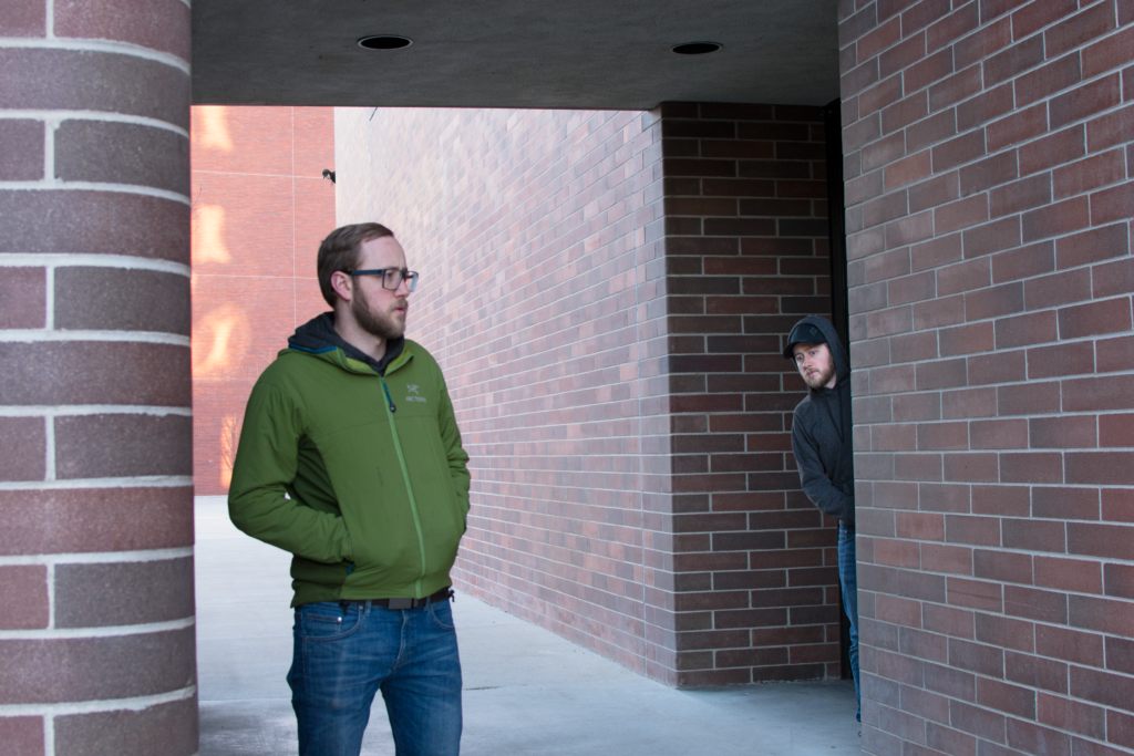
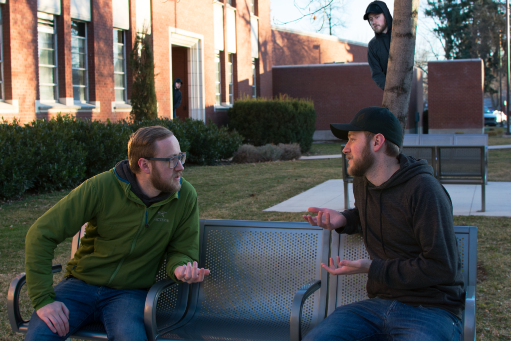
This series is meant to be a vision of the future affecting the present. Fifty years from now my grandson has decided to travel back in time to spend the day following his grandfather around Boise State University.
The photos include three scenes. In the first scene, I am completely unaware of my follower. The second show some realization of something that is off. The third portrays the conversation that follows my catching my doppelgänger grandson. In the first photo the viewer sees me walking on Boise State campus. There is what looks to be a doppelgänger peaking from behind a brick wall. There are another two of them peaking from behind trees. As the doppelgängers are further from the viewer, the are less clear to match the surrounding depth of field. In the bottom left of the composition the phrase “When, not where…” is displayed in black handwritten type. The time of day is just before dusk. There are small puddles on the sidewalk from rain or melted snow.
As stated, the series involves a representation of my future grandson fifty years from now traveling back in to time to observe me. At first he is successful with simply observing. What he did not expect was for me to catch on to his following me and confront him. This confrontation has caused a small paradox to form, thereby causing there to be multiple instances of my grandson coming back to my time. This is portrayed by the repeat of his visit to the same timeline. The phrase “When, not where…” is in reference to his coming from the distant future and not from some other place geographically speaking. The conversation between myself and my future grandson is meant to be an opportunity to converse across time, and therefore further communicate the difference in time.
Utilizing a DSLR camera, tripod, and studio lights I was able to capture multiple images of myself in order to apply masks that would make it seam that I am in more than one place at the same time. Because I represent both myself and my grandson, this makes the photo seem unreal.I changed clothes between the roles to emphasize the idea that even though we look identical, we are actually different people. Using layers in Photoshop, I was able to bring objects from multiple photos into the resulting print. In order to make the doppelgängers fit aesthetically, I used a gaussian blur to make the have an accurate boca according to their placement in the depth of field within the composition. I also adjusted their scale to help with the believability of the photo being considered “straight photography”. I made the type by using a pen and ruler. After I made the letters, I scanned them in as jpeg and then traced them in vector format.
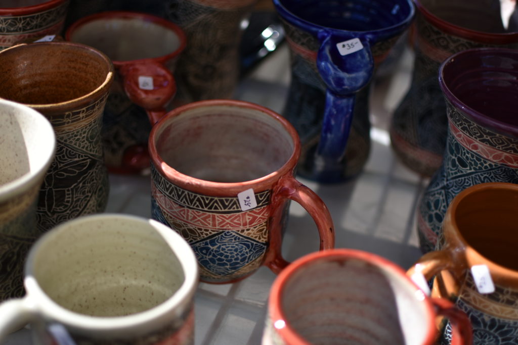
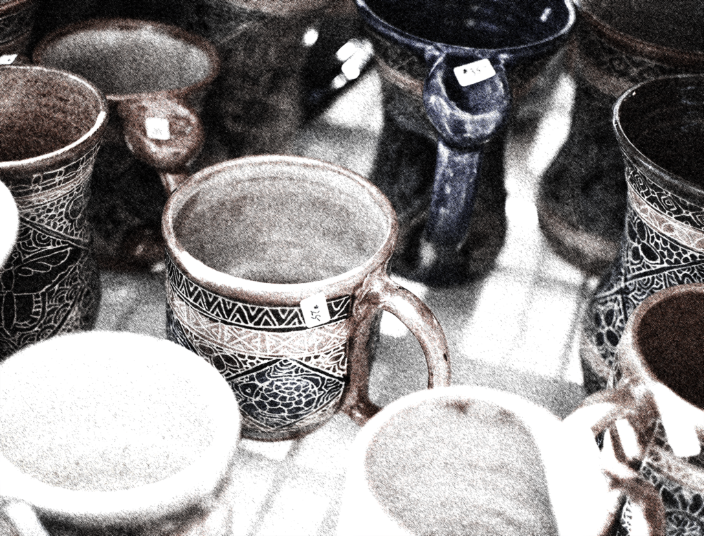
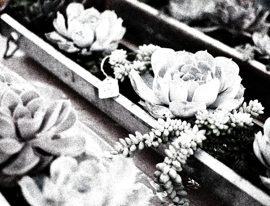
This work is about the diversity one can see within a single community that may not otherwise be apparent. The photographs document two ends of a summer market, showing the variety of goods one can purchase. They are stylized and presented in three different visual art forms as well as displayed in diptych fashion to call the viewers’ attention to their relationship with each other.
On the left is a stylized image of several ceramic mugs. The original color and background layer of photo are barely discernible as the majority of the image has been made such that it looks like a cross-stitch pen drawing. The dark- and mid-tones are black in this cross-stitch effect. The highlights are printed in a clear reflective varnish via screen-printing. The two images are presented side by side in a diptych style.
These images present two ends of a summer market. Upon thinking of this market, one can imagine the diversity they might see when attending. There are people from all walks of life both providing goods and services as well as patronizing these small shops. There is also significant variety in the goods and services provided. I find the market environment to be a wonderful celebration of diversity. The use of three different forms of visual art—photography, line drawing, and screen printing—add another layer of depth to the representation of diversity within these images.
The original photographs were taken with a Nixon DSLR camera. I duplicated the background, desaturated the layers and applied a filter to produce the pen line drawings of the dark- and mid-tones. I then duplicated, desaturated, and inverted the background in order to produce the image to screen-print. The images are printed on matte paper to accommodate the addition of screen-printing. (The screen printing is not visible in the digital file found here)
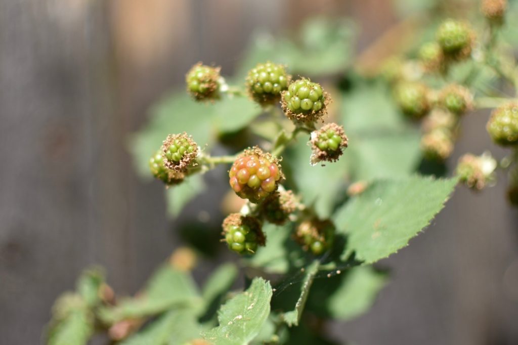
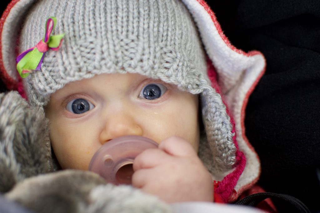
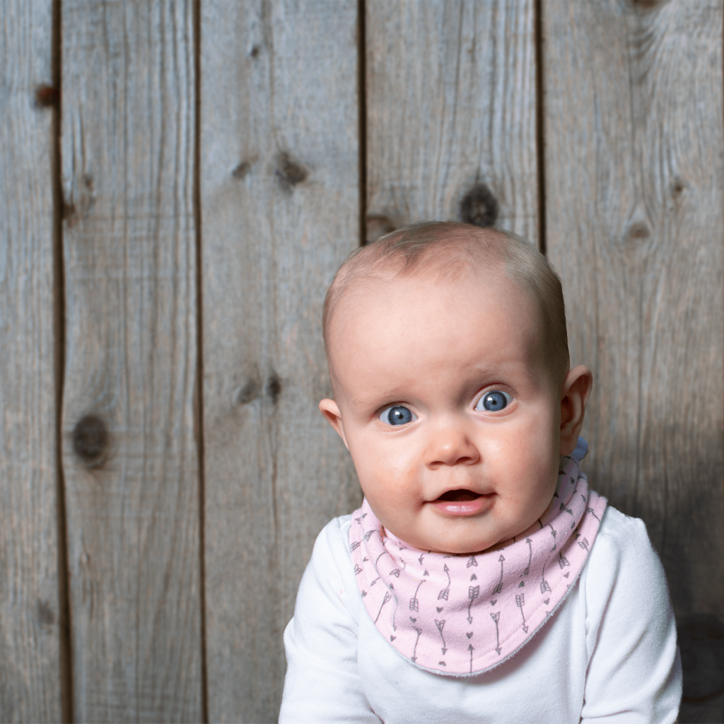
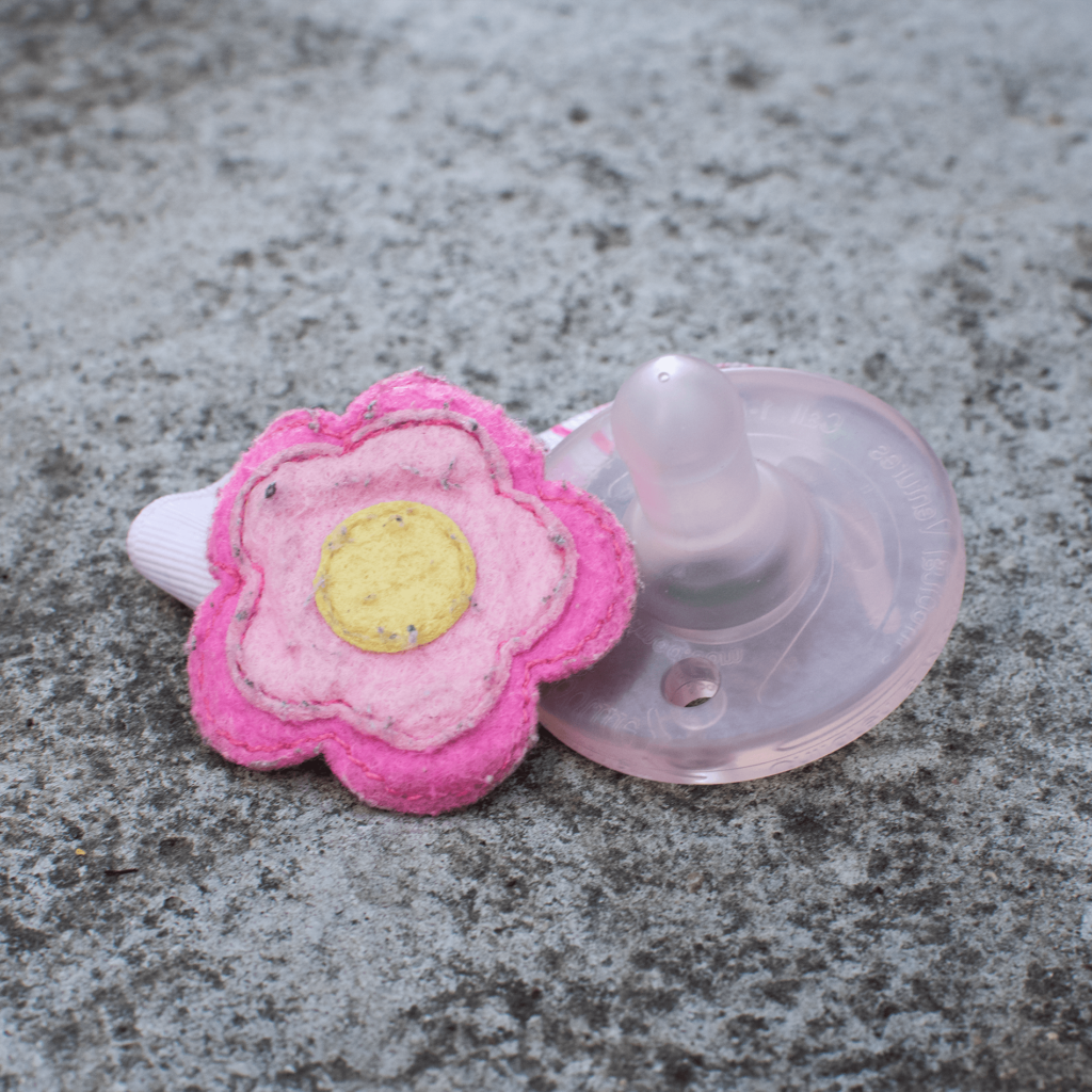
A favorite activity of my daughter’s and mine is to go on walks around our and other neighborhoods searching for beauty that may otherwise be overlooked. I take advantage of the opportunities given to take photographs of things with unapparent beauty such as fences, sidewalks, plants, and even signs. This has been apparent in all of my work this semester and I wanted to bring a part of that work into this diptych involving my daughter and aspects of our favorite activity.
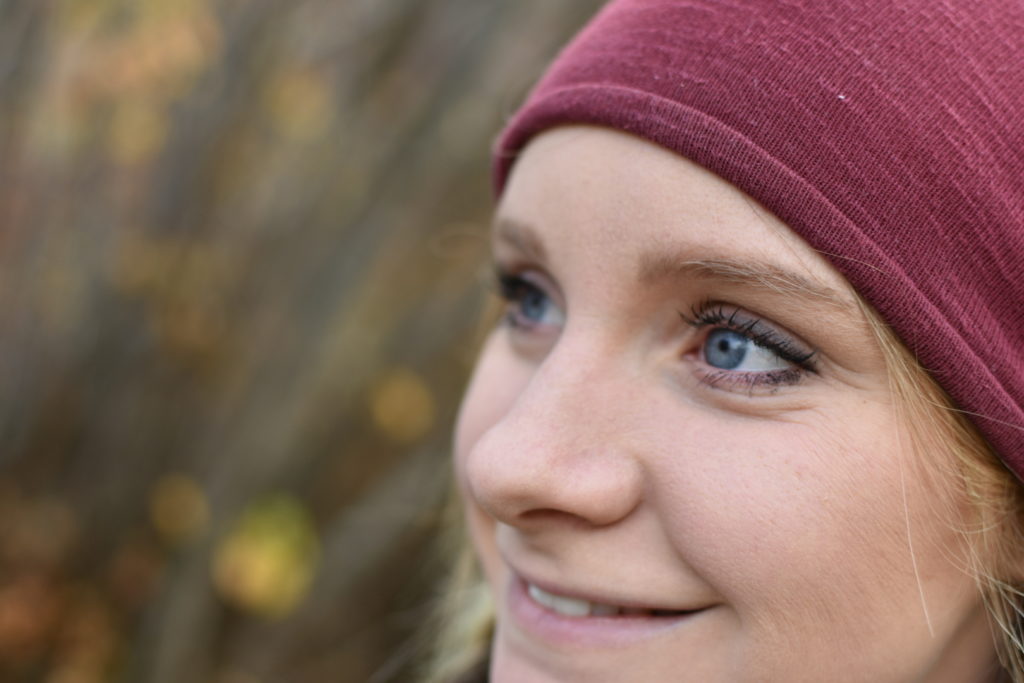
This work includes a composite photographic portrait of my daughter, Ellie, and a still life of likely her favorite thing besides her parents: her pacifier. Both photographs have physical elements that one would find on our walks around neighborhoods. The composite portrait shows Ellie in the lower right portion of the square photograph. There is light coming from the left and slight top of the photograph giving a soft to mid- hard shadow on the right side of her face. The background is a slightly blurred fence with a muted, almost grey tonality, and Ellie is casting a soft shadow on the lower right portion of the fence. Ellie is looking directly at the camera with a slightly surprised and otherwise excited and curious look on her face. Her eyes are wide open. The grey tonality of this photograph is carried into the still life with the pacifier with it’s placement on a concrete block. In both photographs, the subjects are the most saturated or vibrant parts of either composition, though the saturation is not very high.
This work is a continuation of my focus on my daughter, who means the world to me, and documenting the time I get to spend with her even though a lot of it is spent working on various projects for my art degree. The time spent together searching for mundane beauty is represented by the inclusion of the fence background and the placement of the pacifier on concrete. Though some of the detail in the fence was removed in the process of making the photograph believable, the concrete maintains detail and shows the intricate beauty found in the mundane. The ability to create an intriguing and well composed portrait has been a focus of mine over the time I’ve learned photography. Including Ellie in this project gives insight into the priority I set on family, while stretching my photographic and post-editing skills.
The photos were captured on a Nikon DSLR camera. The original portrait was captured with a cloth backdrop and utilized natural light, studio light, as well as a reflector. In photoshop, Ellie was then removed from this background to be placed in front of the fence digitally using selection tools. The original photograph of the fence was too detailed to be convincing as a background, so it was blurred using a Gaussian Blur in order to place it beyond the depth of field. The soft shadow cast on the fence was created using burn tools. The still life of the pacifier was shot using mostly natural light and some saturation was removed to allow the pinks found in the scarf and pacifier to maintain continuity. (Final print was 23″ x 23″)
Thanks to my teacher, Jon Sadler, at Boise State University, my understanding of still life photography was expanded. I originally thought of still life only as something created in a studio setting. I include those compositions that I deliberately create in and out of a studio that don’t fall into other categories of photography.