Global Nav | Clearwater Analytics
Clearwater manages and reports on over $7.3 trillion in assets daily, covering numerous accounts, asset classes, currencies, and regulatory bodies. It provides a unique SaaS-based investment accounting and analytics solution, transforming investment accounting teams into growth drivers. This leads to simplified reporting and quicker, more confident decision-making, ultimately boosting returns.
Problem
The existing navigation solution, with only two levels, was insufficient for a new product requiring four levels of navigation to effectively organize various tools and features.
Process
- Research and Requirements Gathering
- Conducted user research involving surveys, interviews, and focus groups with 20 individuals across several products.
- Identified the need for a four-level navigation structure.
- Design and Prototyping
- Collaborated with another designer to create two navigation prototypes (A and B) using Figma.
- Utilized card sorting activities to identify recurring themes within the feedback.
A:
B:
- User Testing
- Performed A/B testing with 12+ stakeholders, including engineering teams, product managers, end users, and marketing staff, using Userlytics.
- Gathered key insights and user preferences through recorded interactions and verbal feedback.
- Iteration and Refinement
- Consolidated feedback and key learnings, such as the confusion caused by option A regarding breadcrumb navigation.
- Incorporated stakeholder feedback, particularly on white-labeling requirements, into the final sidebar navigation design.
- Implementation and Documentation
- Utilized Figma for design and prototyping, and documented the process using FigJam and Jira.
Outcome
- Successfully redesigned the global navigation for 20+ products, enhancing user experience and clarity.
- Achieved positive reception and feedback during user testing, demonstrating improved navigational efficiency and user satisfaction.
NATIVE APP DESIGN—READY FOR THE DAY | Passion Project
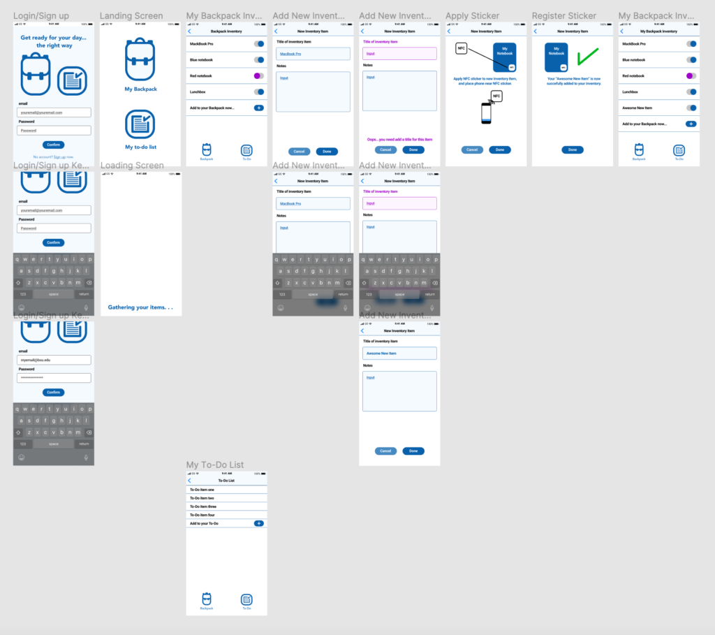
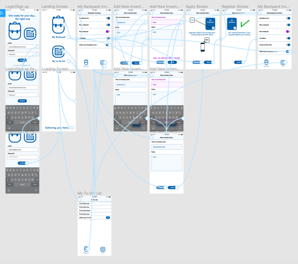
For this exploration into UX design, I interviewed an individual to identify pain points in their morning routine. After identifying said pain point—he stressed over having everything in his backpack when leaving for school—I designed a native app to help resolve the issue. Ready for the Day was born! Using Figma, I created the wire frame and basic user flow for an app that would use NFC technology to know when your pre-registered items were in your backpack when you leave the house.

